Display Styles
Overview
Display styles can be found under the DisplayStyles Folder under Configuration. These are ScreenGuis which Control Hints uses to display generated hints.
Preview Display Styles
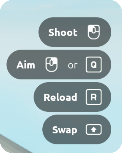
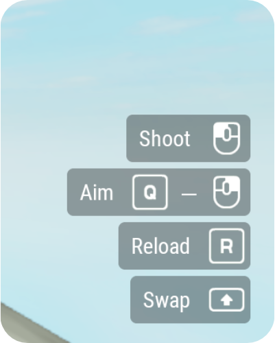
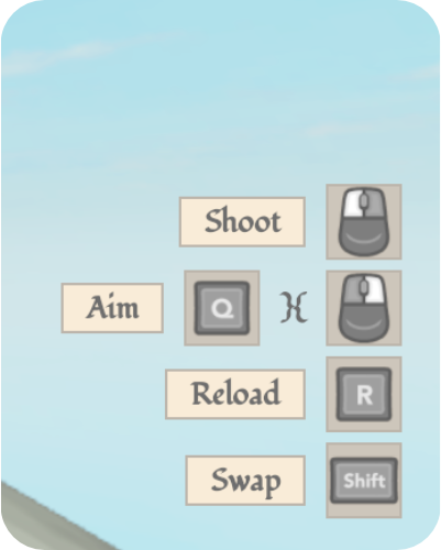
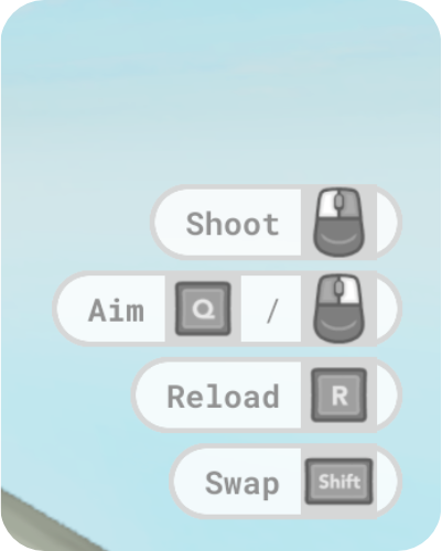
Control Hints comes with 5 display styles:
-
ClassicDefault display style for Control Hints, inspired by Roblox CoreGui.
Recommended icon set:
Kenney -
CompactSmaller profile to avoid distracting the player from the game.
Recommended icon set:
Kenney -
FantasyDecorative display style to use in RPGs and the sort.
Recommended icon set:
Xelu_Dark -
LightSimilar to the
Classicdisplay style, it has a compact form and is a good choice for more casual, playful games.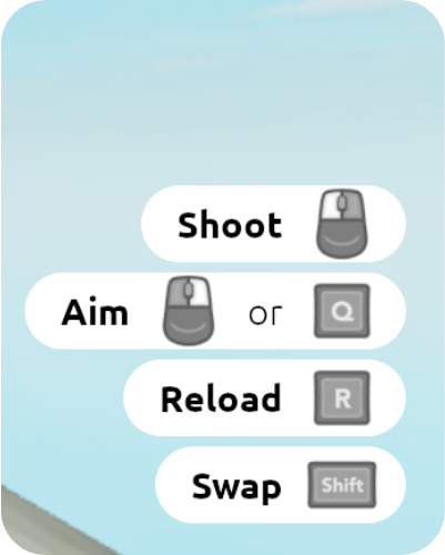
Recommended icon set:
Xelu_Dark -
SciFiFuturistic theme to complement action or sci-fi games.
Recommended icon set:
Xelu_Dark
Creating Display Styles
Control Hints makes it easy to create display styles and modify existing ones.
Structure
It's important that certain instances of a name and class are present within the display style in order for Control Hints to function properly.
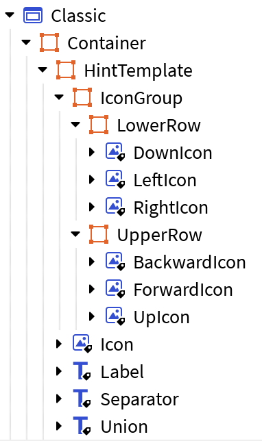
A display style must contain:
ContainerFrame to contain all UI elements.HintTemplateFrame, which is what Control Hints clones to generate hints.IconGroupFrame to contain composite icons.UpIconImageLabel to displayInputBinding.Up.DownIconImageLabel to displayInputBinding.Down.LeftIconImageLabel to displayInputBinding.Left.RightIconImageLabel to displayInputBinding.Right.ForwardIconImageLabel to displayInputBinding.Forward.BackwardIconImageLabel to displayInputBinding.Backward.- Note: The icons (
UpIcon,DownIcon,LeftIcon, etc.) can be nested at any depth insideIconGroup.
IconImageLabel to display a KeyCode.LabelTextLabel to display the name of the InputAction.- Optionally,
SeparatorGuiObject to convey a separation between multiple KeyCodes.- Example: "X or Y to jump"
- Optionally,
UnionGuiObject to convey a union between multiple KeyCodes.- Example: "X and Y to jump"
These are the minimum required elements. You can modify beyond this to sort hints with UIListLayout, or to add background elements to the hint Frame.
Using Dynamic Scaling?
A UISizeConstraint is required for the Icon ImageLabel, the Separator GuiObject, and the Union GuiObject, and a UITextSizeConstraint for the Label TextLabel. If the Separator and the Union are TextLabels, then they should contain a UITextSizeConstraint.
Loading
To select your new display style, ensure it is parented under the DisplayStyles Folder under Configuration, as all the other display styles. Then, update the DISPLAY_STYLE setting in Settings to reference your display style:
Now, when you test your game, Control Hints will use your display style. If there are any issues with it, Control Hints should error/warn with details on what needs fixing. If you encounter errors, ensure that the structure is sound before reporting to the DevForum thread.